CEPA
Website Redesign and Redefined IA
Overview
The Center for European Policy Analysis (CEPA) is a nonprofit, nonpartisan, public policy institution based in Washington DC, focused on strengthening the transatlantic alliance through cutting-edge research, analysis, and programs.
CEPA’s real struggle and challenge with their old website was that their vast content lacked a structural taxonomy and users had a hard time browsing and getting to important reports and articles that CEPA published.
Role
UX Design
IA
User Research
High level Goals
The primary goal was to improve the site’s holistic user experience and interface to make it easier for readers to browse, search and read CEPA's vast content.
The secondary goal was to improve internal taxonomy, and provide the CEPA content team with evergreen modules, building blocks for the website so that staff could be trained to upload and manage content on their own.
Process at a Glance
Discovery
Client introductions and discovery call
Research Strategy
Research Plan
Secondary Research
Landscape Analysis
Internal content audit
Information Architecture
Site Map Draft
Site Map Iterations
Final Site Map
Wireframes and Design
Module Ideation
Early Wireframes
Client Feedback and Iteration
Implementing Feedback
Working Wireframes
Usability Testing
Testing Scenarios
Maze for Semi Moderated Sessions
Research Deliverables
Formal Research Report
Design Deliverables
Final Wireframes
Wrap Up
Impact
Discovery
Client Introductions and Discovery Call
The first step in partnering with CEPA was to deeply understand their goals for the redesign and identify what mattered most to them. I participated in the client kickoff and played an active role in shaping the scope of the website redesign, asking targeted questions to uncover priorities, constraints, and success criteria. This early discovery work established a shared understanding between teams and ensured the redesign effort was grounded in both client needs and realistic project parameters.
Research Strategy
Research Plan
The first step of this project was to define and align on a research plan. Informed by client interviews and the kickoff call, I developed a plan that clearly outlined the research goals, success pillars for the overall project, key hypotheses, and methodology.
This plan served as a shared reference point, ensuring the CEPA team understood not only what research would be conducted, but why it mattered and how it would inform the redesign.

Research Plan Snapshot
Secondary Research
Landscape Analysis
Discovery and secondary research were foundational in shaping the direction of the project and accelerating early design work. By collaborating with the client in real time, we quickly aligned on priorities and focused the scope, which allowed us to identify design elements that directly reflected CEPA’s vision, values, and goals.
This shared understanding translated into clear design principles and early concepts, enabling the team to move confidently and efficiently into the initial phases of design.

Landscape Analysis Workshop
Based on the board above and the conversation with the clients, a high level design solution emerged.
The CEPA team was after a website that allowed users to browse, read and easily access all of CEPA's content and resources.
A want for internal improvement also started to emerge, for CEPA staff to easily upload and maintain content and keep like content together in one place.
Secondary Research
Internal Content Audit
To inform the sitemap and overall information architecture, I conducted an internal content audit focused on understanding CEPA’s content taxonomy. By categorizing and labeling content types, resources, and themes, I was able to identify patterns, redundancies, and opportunities for consolidation. This taxonomy-driven approach directly informed the structure of the sitemap, enabling clearer content groupings and a navigation model that supports intuitive browsing and easier access to key information.
Information Architecture
Site Map Draft
Creating the sitemap for CEPA presented a unique challenge. I used the sitemap as a strategic tool to inventory and rationalize all existing content while rethinking and restructuring the site’s information architecture. This process allowed me to break down and rebuild the overall IA in a way that aligned with the redesign goals and created a clearer, more intuitive experience for users.

Sitemap V1
Information Architecture
Site Iterations
After creating the first version of the sitemap, I led a walkthrough session with the CEPA team to support informed decision-making and alignment. Using the content audit–driven draft as a discussion tool, we reviewed the structure together to assess how well it met their goals and user needs.
By intentionally highlighting gaps and open questions, the session enabled stakeholders to make clear decisions around content priorities and ownership, resulting in stronger alignment and a more confident direction for the next iteration of the sitemap.
Information Architecture
Site Iterations Final Sitemap
The biggest changes came in form of revisions to the primary page titles and the content that they housed. CEPA wanted to highlight the issues that their organization covers and allow users quick access to browsing content through landing pages.

Sitemap V1
Wireframes and Design
Module Ideation
Once the final sitemap was approved, I transitioned into the design and wireframing phase. Before creating high-fidelity mockups or interactions in Figma, I started with exploratory brainstorming—often on paper or in a separate design file—to think through content structure at a system level.
I prioritized designing modular content blocks before defining full page layouts. This approach created consistency across the site, streamlined development, and supported long-term maintainability by allowing both developers and content teams to reuse, adapt, and evolve components over time.
As a result, the site can scale more easily, and content teams can continue to publish and manage updates efficiently without requiring ongoing design or development support.
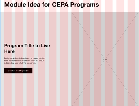

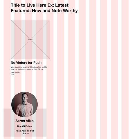
Module Examples
Wireframe Design
Early Wireframes
After an initial phase of brainstorming and sketching, I established a clear direction for the design work. I began by focusing on the site’s most critical pages and defining a reusable set of modular components. These wireframes served as the foundational building blocks for both the visual design and development teams, enabling efficient iteration, consistent application across the site, and a smoother handoff.
By designing modules that could accommodate multiple content types, the team was able to move faster while maintaining flexibility and scalability throughout the website.

Early Wireframes
Client Feedback and Iteration
Implementing Feedback
After presenting the first round of design revisions, the client returned with a consolidated set of feedback. I reviewed the input holistically and guided the client through key trade-offs, helping them understand the implications of different design choices on usability, scalability, and site consistency.
Using this approach, I was able to incorporate changes where appropriate and propose alternative solutions when needed, ensuring that each iteration aligned with both their goals and the overall design strategy.
This collaborative process reduced rework, built client confidence, and allowed the design to evolve thoughtfully.

Client Feedback Document
Client Feedback and Iteration
Working Wireframes
The working version of these wireframes was designed to serve as the foundation for usability testing. However, before moving into testing, it was critical to first incorporate all client and stakeholder feedback to ensure that the wireframes reflected the strongest possible solutions.
By iterating based on this feedback, we were able to identify and refine the most effective versions of the wireframes, which could then be tested to validate usability, content clarity, and overall user experience.
This approach ensured that testing focused on the highest-quality designs, producing actionable insights that would directly inform the final visual design and development.

Working Wireframes
Usability Testing
Testing Scenarios
Before conducting usability testing, I defined the testing approach by developing and refining scenarios and questions designed to surface the most meaningful insights. By thoughtfully shaping these prompts in advance, I ensured the sessions focused on critical user behaviors and decision points, leading to clear, actionable findings.
Usability Testing
Maze for Semi Moderated Sessions
Once the wireframes were approved, I led remote usability testing to validate and strengthen the designs. Using Maze, I tested an interactive Figma prototype, enabling participants to complete key tasks asynchronously while capturing behavioral data such as success rates, heat maps, and time on task.
This remote tooling allowed for efficient testing at scale and provided clear, data-backed insights into how users navigated the experience.
The findings from this round of usability testing directly informed refinements to the wireframes, ensuring the final designs reflected validated user behavior and addressed areas of friction before moving into visual design and development.


Usability Testing Snapshots
Research Deliverables
Formal Research Report
As part of the wireframing process, I delivered two complementary research artifacts for CEPA. Maze generated a detailed usability report that captured user behavior through metrics such as task success, heat maps, and time on task.
To contextualize these findings, I authored an applied psychology–focused UX research report that connected what we learned through testing to established UX best practices and behavioral principles.
Together, these reports translated raw usability data into clear, evidence-based design rationale, reinforcing the changes made in the finalized wireframes. This pairing helped build stakeholder confidence, supported informed decision-making, and created a set of durable resources the team could reference as the website continued to evolve. Excerpts from the research report are included below.

Research Report Excerpts
Design Deliverables
Final Wireframes
After synthesizing insights from the research report and usability testing, I implemented final refinements to the wireframes. These updates were informed by task completion rates, overall test success, and observed user behavior, allowing me to resolve friction points and improve clarity across key flows. I then presented both the findings and the finalized wireframes to the client, clearly connecting research insights to design decisions.
This approach reinforced stakeholder confidence and resulted in a set of validated, research-backed wireframes that positioned the team to move seamlessly into visual design and development.

Final Wireframes
Wrap Up
Impact
The UX process for CEPA emphasized testing, iteration, and a modular-first design approach. By designing and validating reusable content modules early, the team was able to create a flexible system that supported clearer content organization and more intuitive browsing. Grounded in structured research and continuous testing, this work demonstrated how UX research and design function together to drive meaningful outcomes.
The final website resulted in a 100% increase in user traffic and retention, driven by improved information architecture and key modular components that allow users to easily explore content by category and program.