BEMORE
Mobile Product and UX Design for Local Non Profits
Overview
BEMORE is a mobile product born out need rather than want. Like most cities, Baltimore, MD has very few digital spaces or resources to connect local volunteers with nonprofits.
I wanted to change that. And for that change, I needed to develop, design and build something new.
BEMORE, a mobile application design, was the result of building a product from the ground up based on user research first and user interface design second.
Here's how BEMORE went from an idea to a tangible product.
Role
Product Designer
User Researcher
High Level Goals
Research, design and test a mobile first application that connected volunteers to community events in and around Baltimore city
Design a high fidelity prototype
Create a digital space that enriched and valued the greater good without the hassle of searches and applications
Process at a Glance
Discovery
Foundational Research
Problem Framing
Secondary Research
Desk Research
Landscape Analysis
Research Planning
Research Plan
User Interview Materials
Participant Recruitment
User Interviews as Feature Discovery
Remote User Interviews
Interview Synthesis
MVP Feature List
User Flows
Flow Ideation
Design Ideation
Early Sketches
Lowest Fidelity Wireframes
Early Prototyping and Usability Testing
Early Prototyping
Usability Testing
Usability Testing Synthesis and Insights
Usability Testing Synthesis
Insights
Design Iteration
Prototype V2
Survey and Style Guide
Survey for UI Design
Style Guide
Final Designs and Prototypes
Final Mockups
Final Prototypes
Wrap Up
Lessons Learned
Impact
Discovery
Foundational Research
The volunteer technology landscape is highly saturated, making differentiation a key challenge. A central focus of foundational research was understanding how to design a mobile-first volunteer platform that met user expectations while clearly communicating event details within the constraints of a small screen, without overwhelming users.
Discovery
Problem Framing
Local volunteer opportunities are often fragmented across websites, email lists, and social platforms, creating friction for people who want to engage in their communities. While social media has made sharing and discovery effortless, volunteering still requires navigating complex interfaces, dense information, and inconsistent experiences, especially on mobile.
The challenge was to design a seamless, mobile-first volunteering experience that lowered the barrier to participation and made acts of service feel as accessible and intuitive as using a social platform.
The goal was to support quick discovery, clear commitment, and a sense of local community without overwhelming users or trivializing the impact of volunteering. This project focused on reframing volunteering as a lightweight, everyday action by applying familiar interaction patterns from social products to a purpose-driven context, enabling users to move from intent to action with minimal friction.
Secondary Research
Desk Research
Desk research surfaced a highly saturated, web-first volunteer platform landscape characterized by long, friction-heavy paths to basic information. While these patterns pointed to systemic usability issues, they did not explain the underlying motivations, trade-offs, or contextual factors influencing user behavior, particularly in a mobile-first environment.
To close this insight gap, I intentionally shifted to primary qualitative research, using user interviews to pressure-test assumptions and ground the product direction in real-world needs.
This approach ensured BEMORE was informed not just by market norms, but by the lived experiences, expectations, and decision-making processes of potential users, providing a stronger foundation for prioritization and design strategy.
Secondary Research
Landscape Analysis
During discovery, I conducted a competitive landscape analysis across nonprofit and adjacent markets to understand how similar problems were being solved. This work revealed transferable UX patterns and unmet needs, informing key product decisions and guiding early design strategy for BEMORE.

Snapshot of simple landscape Analysis
Research Planning
Research Plan
To avoid leading with assumptions, I designed and implemented a user-focused research plan rooted in deep qualitative discovery. I started by conducting semi-structured user interviews to understand users’ goals, motivations, and pain points before defining any solutions. Interview guides were intentionally open-ended, allowing participants to share their experiences in their own words and helping surface unmet needs we hadn’t anticipated.
During interviews, I focused on behaviors and decision-making rather than stated preferences, asking users to walk through real scenarios, past experiences, and moments of friction. This approach helped uncover the why behind their actions, revealing mental models, constraints, and emotional drivers that wouldn’t have emerged through surveys alone. I synthesized findings into key themes and opportunity areas, validating patterns across participants to ensure insights reflected real user needs rather than isolated opinions.
These insights became the foundation for BEMORE’s product direction. By grounding decisions in what users actually needed and would use, the team was able to prioritize features with confidence and align around a shared understanding of the problem space. This research-first approach ensured BEMORE was built with intention, driven by evidence, empathy, and a clear user-centered “why.”
Research Planning
User Interview Materials
I started by drafting and finalizing the BEMORE user interview moderator guide, tailored for remote, semi-structured sessions. The guide was designed to uncover users’ motivations, behaviors, and pain points without leading the conversation.
Next, I created a dedicated note-taking framework to capture insights in real time while moderating, ensuring no critical observations were missed and making synthesis more efficient.
Finally, I developed a participant tracker to monitor the number and types of users interviewed. This helped ensure diverse perspectives were represented and that research goals were systematically met.
Together, these materials enabled a structured and thorough research process, providing clear, actionable insights that directly informed BEMORE’s product decisions and priorities.
Research Planning
Participant Recruitment
Given the exploratory nature of the BEMORE research, participants needed to be recruited organically rather than through a pre-existing panel. To reach the right audience, I leaned heavily on engagement from social media surveys, crafting posts and prompts that encouraged authentic responses and participation.
I also defined clear screening criteria to ensure participants represented the target user groups and experiences most relevant to BEMORE, helping maintain the quality and relevance of insights.
This approach allowed me to connect with a diverse range of users, ensuring the study captured a variety of perspectives and real-world experiences. By recruiting participants through channels they were already active in, I was able to generate meaningful insights while maintaining a user-centered and accessible recruitment process.
User Interviews as Feature Discovery
Remote User Interviews
I recruited participants from a larger pool, focusing primarily on younger users aged 22–35 who live and work in Baltimore City. My goal was to understand personal experiences and journeys navigating volunteer opportunities in a digital space, uncovering pain points, motivations, and unmet needs.
I conducted semi-structured interviews, using open-ended questions and scenario walkthroughs to capture behaviors, decision-making, and emotional drivers. I took detailed notes and synthesized findings into themes, mapping patterns across participants to identify the most pressing user needs.
These insights directly informed BEMORE’s product decisions, shaping feature priorities, streamlining workflows, and guiding the design of digital experiences that users would actually engage with. By grounding decisions in real user experiences, the product was built with purpose, clarity, and measurable impact.

Snapshot the User Interview Note Taking Space
User Interviews as Feature Discovery
Interview Synthesis
After conducting user interviews, I carefully synthesized the findings to identify key patterns, pain points, and opportunities. I grouped insights into thematic clusters, mapping user needs, behaviors, and motivations to ensure that our understanding was grounded in real experiences rather than assumptions.
From these insights, I prioritized the most critical problems to address, which informed the creation of an MVP feature list. Each feature was directly tied to a validated user need, ensuring that early development focused on delivering meaningful value and solving real pain points.
This MVP then served as a foundation for subsequent iterations, guiding design refinements and helping the team test, validate, and evolve features based on real user feedback.
User Interviews as Feature Discovery
MVP Feature List
Based on user interviews, I synthesized insights into prioritized MVP features for BEMORE. Each feature directly addresses a validated user need, ensuring the app focuses on what truly matters to users:
-
Ease of Use
Insight: Users repeatedly emphasized the importance of a simple, intuitive experience to quickly navigate opportunities without frustration. -
Search by Time & Location
Insight: Participants wanted to find volunteer opportunities that fit their schedules and were nearby, making flexible filtering critical. -
Direct Access to Organization Pages
Insight: Users valued the ability to learn more about organizations immediately, rather than having to leave the app to search externally. -
Social Sharing (De-prioritized)
Insight: Contrary to initial assumptions, users indicated that sharing volunteer activity on social platforms was not a priority, so this feature was moved lower in the roadmap.
This feature list set provided a focused foundation for early testing, aligning product development with real user needs while setting the stage for iterative improvements.
User Flows
Flow Ideation
User research revealed that users wanted to browse volunteer opportunities and community events without being forced to sign up for an email account.
In response, I designed a task flow centered on this need, allowing users to explore events in a meaningful and frictionless way. This flow prioritized discoverability and ease of navigation, ensuring BEMORE supported users in quickly finding relevant opportunities while respecting their preferences and autonomy.
Although this was just one part of the first draft of the overall product flow, it directly informed later wireframes and MVP features, guiding design decisions and ensuring that user needs remained central throughout development.

Snapshot of a simple user flow for BEMORE
Design Ideation
Early Sketches
I began the design process with quick sketches to give BEMORE a tangible form. At this stage, the product existed only as an idea and a feature list, so sketching helped translate concepts into visual representations, explore layout options, and start imagining how users would interact with key features.
These sketches served as a tool for iterative exploration, allowing me to rapidly test ideas, refine interactions, and identify the most promising directions before moving into wireframes and higher-fidelity prototypes.

Early Sketches for BEMORE
Design Ideation
Lowest Fidelity Wireframes
I translated initial sketches into low-fidelity wireframes and wireflows to begin visualizing BEMORE’s mobile experience. Using Sketch and InVision, I created the first interactive ideations of the application, exploring layout, navigation, and task flows while keeping the focus on usability and user needs.
These early wireframes allowed for rapid iteration, helping me test concepts, validate design decisions, and prepare for higher-fidelity prototypes.


Lowest Fidelity Wireframes for BEMORE
Early Prototyping and Usability Testing
Lowest Fidelity Wireframes
I developed early wireframes to explore foundational task flows and assess how BEMORE could translate into a clear, usable mobile experience aligned with established design best practices.
Given the exploratory nature of these prototypes, the emphasis was placed on validating flow logic and capturing insights from testing to inform subsequent iterations, rather than visual fidelity.
Early Prototyping and Usability Testing
Usability Testing
I led six in-person, moderated usability sessions using a think-aloud protocol to evaluate whether early design assumptions supported intuitive navigation and efficient task completion.
The sessions were intentionally scoped around core, high-frequency tasks to assess information hierarchy, affordance clarity, and users’ mental models at first exposure.
Rather than validating UI polish, the goal was to surface early signals around where users hesitated, misinterpreted actions, or deviated from intended flows, allowing these insights to directly inform prioritization and iteration.
Sample prompts included:
How would you move through these screens?
Where would you expect to return to the home screen?
What actions do you expect to be available from the home screen?
Where would you look to discover local events?
Usability Testing Synthesis and Insights
Usability Testing Synthesis
Usability testing revealed significant misalignment between the intended experience and users’ initial understanding of the product. Participants struggled to interpret the home screen, clarify the purpose of the app, and identify next actions, indicating breakdowns in information hierarchy, labeling, and value communication.
While these findings challenged early assumptions, they provided high-signal insight into where the experience was failing at first touch. I synthesized these observations into a prioritized set of usability issues and used them to guide the next iteration, reframing the home experience, clarifying core functionality, and strengthening the product’s value proposition.
Usability Testing Synthesis and Insights
Insights
Insights from usability testing directly informed a shift in how the core experience was structured and communicated. The home screen was redesigned to more clearly articulate the app’s purpose and primary actions, reducing ambiguity at first touch. Navigation and labeling were simplified to better align with users’ mental models, and event discovery was elevated as a primary, immediately visible action.
These changes reframed the experience around clarity and momentum, helping users quickly understand what BEMORE is, what they can do, and how to take action within the first moments of use.

Snapshot of Testing Insights and Pulled Quotes
Design Iteration
Prototype V2
I translated usability testing insights into a focused iteration of the BEMORE prototype, systematically addressing the highest-impact issues identified during testing. Changes were prioritized based on severity of user confusion, frequency across sessions, and impact on core task completion and first-touch understanding.

BEMORE V2 Prototype
Survey and Style Guide
Survey for UI Design
Visual design ideation began with a user survey to understand aesthetic preferences, trust cues, and emotional expectations around community and volunteering. These insights informed a foundational set of visual principles and guidelines that could scale alongside the product.
From the outset, the visual language was treated as an early design system rather than a set of one-off screens. Components, spacing, and typographic choices were intentionally lightweight, consistent, and reusable, allowing the interface to evolve as functional changes were introduced without compromising cohesion.
A light, clean aesthetic was selected to reinforce approachability and optimism, while remaining appropriate for the sensitive, purpose-driven nature of the product.


Visual Design Survey Results
Survey and Style Guide
Style Guide
With no existing brand constraints, the logo exploration focused on establishing a visual identity that could scale over time.
The goal was to create a mark that felt clean and timeless, while subtly reflecting community engagement and local pride within Baltimore City.
The resulting direction balances simplicity with meaning, supporting recognition and consistency across the product without competing with the core experience.
.

BEMORE Logo

BEMORE Style Guide Snapshot
Final Designs and Prototypes
Final Mockups
In the development of the BEMORE app, I established and utilized a robust design system, alongside a detailed style guide, to maintain design consistency and alignment with the product’s vision.
The process began with the creation of high-fidelity mockups that outlined critical screens and their corresponding user flows.
These mockups were integral in defining the user experience and served as a key reference for the subsequent prototype, ensuring a seamless transition from design to execution.
.


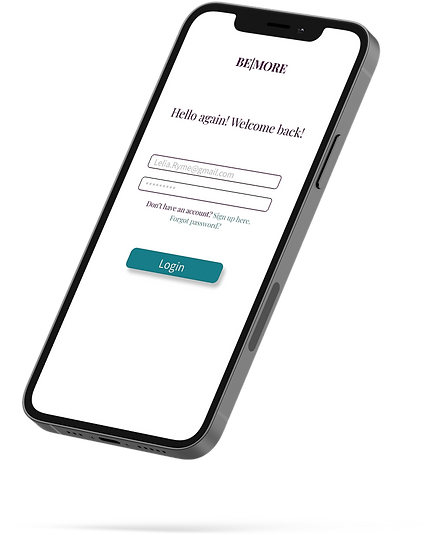
BEMORE Mockups Snapshot
Final Designs and Prototypes
Final Prototypes
The culmination of this project resulted in the BEMORE prototypes, which are showcased below.


BEMORE Prototypes
Wrap Up
Lessons Learned
Throughout the BEMORE project, one of the most impactful insights I gained was the value of an iterative design process. The continuous cycle of testing, feedback, and refinement was crucial in aligning the product with both user needs and business goals. By leveraging this iterative approach, I was able to ensure that each design decision was informed by real-world data, rather than assumptions, leading to a more effective and user-centric final product.
A pivotal aspect of this process was the use of user interviews to define and prioritize key features. These direct insights from users provided a deeper understanding of their pain points, motivations, and behavioral patterns, which directly influenced the feature set and functionality of the product. This focus on qualitative data ensured that BEMORE's features were not only aligned with user needs but also optimized for usability and engagement.
This experience reinforced the importance of a user-centered approach throughout all stages of product development. It also highlighted the need for ongoing validation and adaptability, ensuring the product evolves in response to real user input, rather than rigidly sticking to preconceived notions.
Wrap Up
Impact
Working on a new product allowed me to fully embrace the "test then build" framework, refining my approach to iterative design. By grounding my work in thorough user research and insights, I was able to create a product that not only stands out in an oversaturated and often uninspiring market, but also prioritizes the user experience at every step.
Looking ahead, my next goal is to connect with local nonprofits and community organizations in the Baltimore area.
This will help open up new opportunities for BEMORE users, while also facilitating meaningful connections between nonprofits and locals eager to contribute their time to community service.
Designing BEMORE from research through to final build challenged me to grow both as a designer and as a UX lead. Although the process was demanding, it ultimately led to the creation of a product with real, tangible value. Through rounds of user testing, use cases, and surveys, I gained a deeper understanding of how simplicity and thoughtful feature design can enhance a product's impact and usability.